By Tom Nash
Let’s face it, we’ve certainly not seen the last of the global issues. To keep up, agricultural and food businesses now need to have clarity of their performance and visibility of the market they work in.
This requires the collection of valuable market data in a central location, such as a dashboard. As a valuable insight tool, it can help with key strategic decisions and strengthen any business.
To find value in a dashboard, however, its capabilities must be reflective of a business’s needs and motivations. There are two areas to consider when selecting the right dashboard for you:

Once you’ve created a list of measures and objectives, it’s time to rank them in importance. In theory, there is no limit to how much information can be covered in a dashboard, but in practice, it should only cover the most important data. You don’t want to overcomplicate matters with too much detail; it’ll only hinder you going forward.
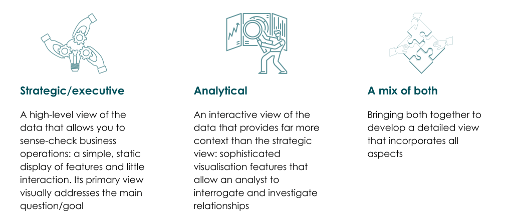
Ranking your key goals will help you to categorise the role of your dashboard and how you truly see it fitting into your business. Generally, you will fall into one of three categories and this will have implications for the style of dashboard you choose to develop:
Making it easy to interpret the data quickly and accurately
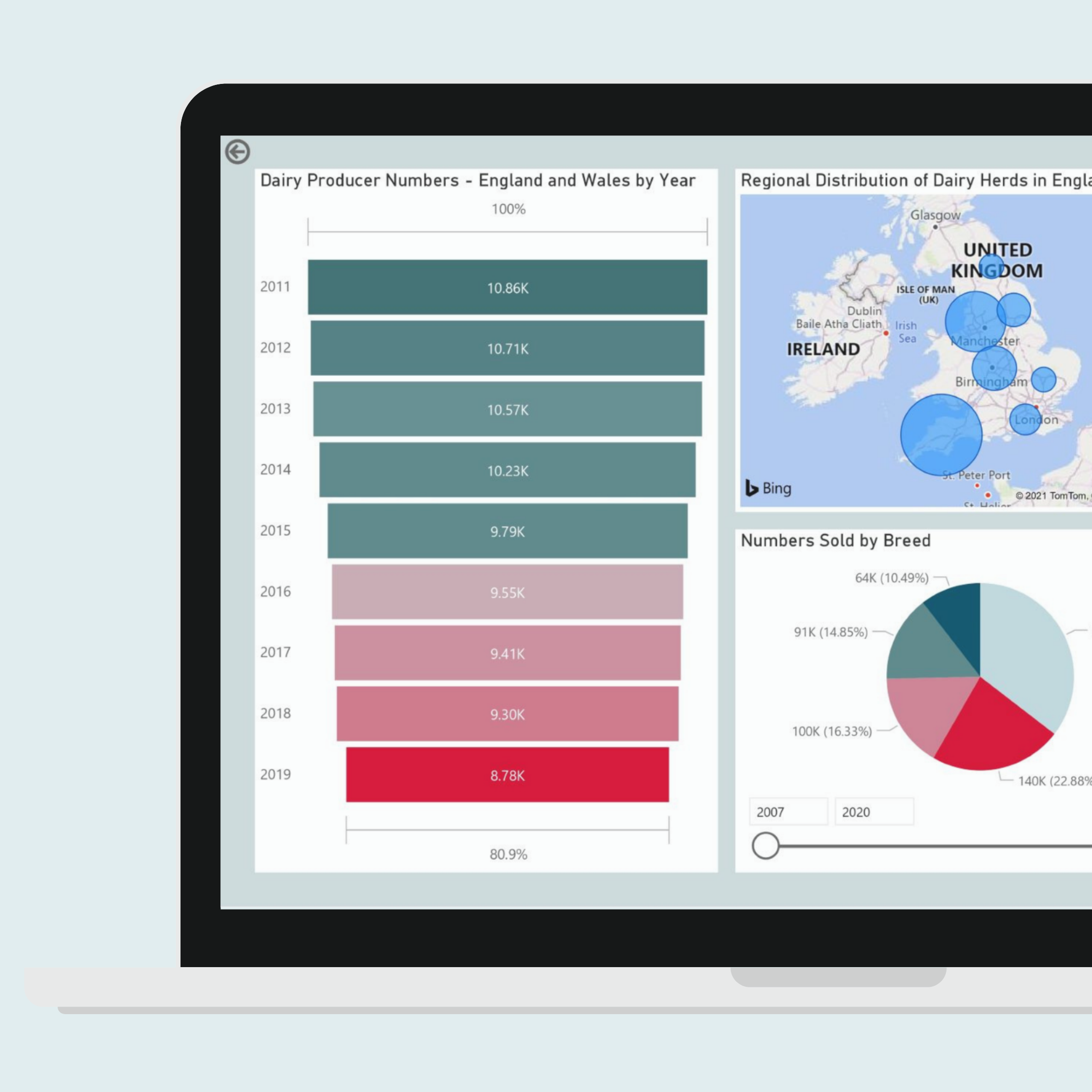
Ultimately, a dashboard should make your life easier by giving you a quick and clear way to view the information you need. For a strategic/executive view, this will likely be high-level summaries and highlights of data points that are exceptions from the rest, the outliers.
A dashboard designer should facilitate this with features that help to evaluate the data – visual ‘traffic light’ objects and conditional formatting (changing the appearance of something on the basis of a defined condition) can help to tell you if something is good or bad.
With an analytical view, you should be able to investigate relationships within the data. The way visuals are organised on the page makes a big difference to how easily links and associations in the data can be identified. To give context to a KPI and measure, it’s helpful to ensure comparisons against a time series, benchmark or target are included.
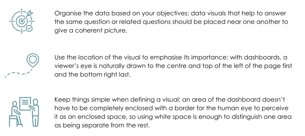
Location: giving a coherent picture of the data
To get the most value out of a dashboard, it’s important to evaluate the way it looks. While content is key, so is how easy you can read and understand that content. Here are some successfully proven ways to display key data on a dashboard:
Encourage meaningful comparisons
A detailed dashboard will help you benchmark against other companies in your market, so it’s vital that you encourage meaningful comparisons between your data points. Putting greater emphasis on how comparatives are displayed will help to reduce the time spent analysing figures and provide greater capacity for making informed strategical decisions.
If a specific metric is displayed two ways, place them next to each other; if two-line charts have the same time frame, stack them vertically to make it easier to compare. On the flip side, try to discourage meaningless comparisons.
It may seem like simple suggestions but establishing what you want to achieve from a dashboard and how you want to achieve it is an essential part of the process. We’re here to help you on this journey! We’ll work with you to develop an interactive market dashboard that is tailored to your needs and objectives.
If you’d like to learn more about our bespoke market dashboards and how they can have a positive impact on your business, then sign up today for a one-to-one demo.
About The Author